Geolocation US
In [1]:
#!pip install geopandas
#!pip install matplotlib
#!pip install geodatasets
In [2]:
# https://medium.com/@jl_ruiz/plot-maps-from-the-us-census-bureau-using-geopandas-and-contextily-in-python-df787647ef77
# Plotting the US Map
import pandas as pd
from shapely.geometry import Point
import geopandas as gpd
import matplotlib.pyplot as plt
#################################################
## USA MAP
#https://www2.census.gov/geo/tiger/GENZ2018/shp/cb_2018_us_state_500k.zip
map = gpd.read_file("H:\\My Drive\\0001_projects\\2024\\Maps\\cb_2018_us_state_500k.zip")
non_continental = ['HI','VI','MP','GU','AK','AS','PR']
us49 = map
for n in non_continental:
    us49 = us49[us49.STUSPS != n]
#################################################
## Points
data = {
    'City': ['New York', 'Los Angeles', 'Chicago'],
    'Latitude': [40.7128, 34.0522, 41.8781],
    'Longitude': [-74.0060, -118.2437, -87.6298]
}
df = pd.DataFrame(data)
geometry = [Point(xy) for xy in zip(df['Longitude'], df['Latitude'])]
gdf = gpd.GeoDataFrame(df, geometry=geometry)
##################################################
# Plotting the US map
## colors: 'summer','Pastel1','white'
fig, ax = plt.subplots(1, 1, figsize=(10, 10))
us49.plot(ax=ax, cmap='Pastel1', edgecolor='k')
gdf.plot(ax=ax, color='red', markersize=50)
plt.title('US Map')
plt.show()

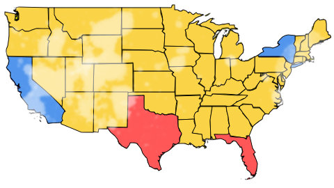
In [3]:
import pandas as pd
import geopandas as gpd
import matplotlib.pyplot as plt

###############################################################
# Sample DataFrame with state names and their political colors
data = {
    'state': ['CA', 'TX', 'NY', 'FL'],
    'color': ['blue', 'red', 'blue', 'red']
}
df = pd.DataFrame(data)
###############################################################
##
#https://www2.census.gov/geo/tiger/GENZ2018/shp/cb_2018_us_state_500k.zip
map = gpd.read_file("H:\\My Drive\\0001_projects\\2024\\Maps\\cb_2018_us_state_500k.zip")
non_continental = ['HI','VI','MP','GU','AK','AS','PR']
us49 = map
for n in non_continental:
    us49 = us49[us49.STUSPS != n]
###############################################################
##
## Merge the GeoDataFrame with the political colors DataFrame
merged = us49.set_index('STUSPS').join(df.set_index('state'))
merged.fillna({'color':'Yellow'}, inplace = True)
###############################################################
## Plotting the US map with political colors
fig, ax = plt.subplots(1, 1, figsize=(15, 10))
merged.plot(ax=ax, color=merged['color'], edgecolor='black')
plt.title('US map')
plt.show()
